
Pricing


AI writer

Taplio
MCP V2
New: Engage tools
Taplio MCP V2 now available, try it out
Your AI can now comment and reply for you. It finds the posts worth engaging, drafts in your voice and queues them on your Taplio account. Nothing posts until you confirm.

Best LinkedIn banners: examples worth copying

September 21, 2026

13
min read

 Open in ChatGPT
 Open in Claude
 Open in Perplexity
Key Takeaways
- Best LinkedIn banner: a 1584 by 396 pixel design with one dominant element, one contrast point and one message, where the role decides the pattern, a stat-led number for recruiters, a bold one-line statement for founders, a topic-pill layout for creators.
- 9 patterns cover most roles: a bold one-line statement, a quote-led design, a stat-led proof number, a split-panel headshot, a workspace backdrop, a minimalist icon row, a logo wall, a before-after transition, and a topic-pill creator banner each solve a different first-impression goal.
- The zone that decides the layout: the bottom-left corner of every LinkedIn banner needs to stay clear, because the circular profile photo overlaps that corner of the 1584 by 396 canvas on LinkedIn's desktop layout.
- What to check before publishing a banner: the file is built at the full 1584 by 396 pixel size, one message drives the whole design, the bottom-left corner is clear, and any number or client name shown is one that can be backed up if asked.
- The decision rule: pick a stat-led or logo-wall pattern to lead with proof, pick a quote-led or bold-statement pattern to lead with a point of view, and pick a split-panel or before-after pattern when a job search is the goal.
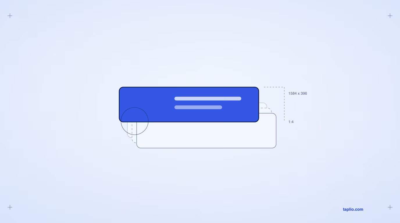
The best LinkedIn banners share three things: a clear visual hierarchy, one strong contrast point, and exactly one message. This gallery renders 9 patterns at LinkedIn's banner size of 1584 by 396 pixels, each one a layout you can copy today. Pick the pattern that matches your role in the section further down, then swap in your own name, number or quote.
What makes a LinkedIn banner worth copying
A LinkedIn banner is worth copying when it passes three checks: hierarchy, contrast, and one message. Hierarchy means the eye lands on a single dominant element first: a headline, a number, or a photo, not four blocks fighting for attention. Contrast means that dominant element differs from everything around it in weight, size, or color, not by a few pixels.
One message means the banner says one thing about you, not your full biography squeezed into a strip 396 pixels tall. Each design further down states its own trade-off next to what it does well, because no single pattern fits every role. For the fuller list of banner ideas, the 5-step build process, and the mistakes list, see Taplio's LinkedIn banner guide, which owns that ground.
9 LinkedIn banner examples worth copying
Each example below is a complete, rendered banner at 1584 by 396 pixels, the size LinkedIn crops your upload to. Every one keeps the bottom-left corner clear, marked by a dashed circle, because that is where your circular profile photo sits on desktop and overlaps the banner. Every name, company and number on these banners is fictional and written to show the pattern, so treat the copy as a placeholder for your own. Read the caption under each image for the pattern name and its trade-off, then the paragraph below it for why the pattern works.
1. The bold one-line statement
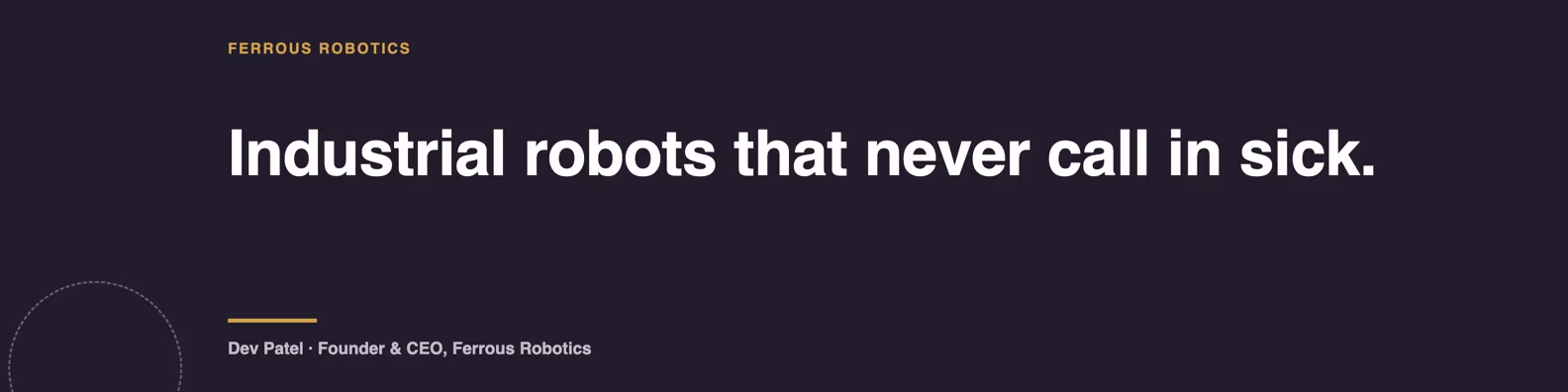
Dev Patel's banner for Ferrous Robotics uses a solid dark plum ground and a single line of large type, nothing else. Hierarchy takes care of itself when there is only one element on the canvas: the eye has nowhere else to go. The contrast comes from scale alone, so the type stays readable in a profile preview, not only on the full profile view.
This pattern costs you the least to build and does not date, but it only works if your one sentence is sharp. A generic statement like "building the future of work" on a bare background reads as empty rather than confident, so this pattern rewards a specific, ownable claim over a vague mission line.
2. The quote-led banner
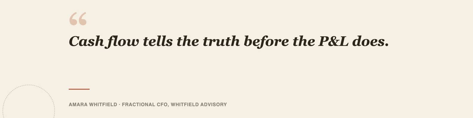
Amara Whitfield's banner for Whitfield Advisory sets one short, opinionated sentence in large serif type against a warm cream ground, with her name and title in capitals underneath as the attribution. The serif type and the quotation marks signal "this is a belief, not a slogan," which reads as more personal than a bold statement banner. Contrast here comes from type pairing, a large serif headline against a small sans-serif attribution line, rather than from color.
The quote-led pattern suits anyone whose opinion is the product: consultants, coaches, and analysts. For a ready list of lines to adapt, Taplio's LinkedIn banner quotes guide has more than 80 to start from instead of writing one from scratch.
3. The stat-led proof banner
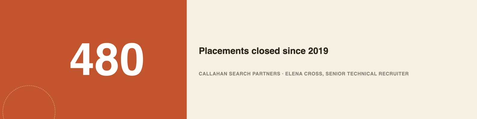
Callahan Search Partners leads with "480" set at a huge scale, with "placements closed since 2019" as the only supporting line, on a two-tone terracotta and cream panel. The number is the hierarchy, everything else on the banner is smaller and quieter by design. A viewer registers the number before anything else on the page, which makes this the quickest of the 9 patterns to scan.
The stat-led pattern only works with a number you can stand behind if someone asks: a rounded, honest figure beats a suspiciously precise one. It suits recruiters, salespeople, and agencies with one clear outcome metric more than roles whose proof is qualitative.
4. The split-panel headshot
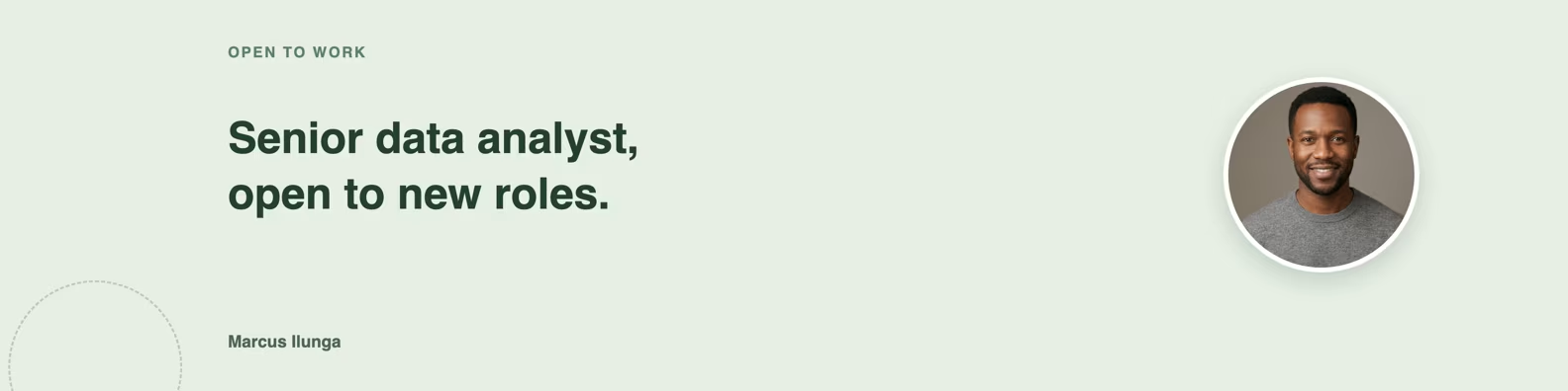
Marcus Ilunga's banner splits the canvas into two zones: a tagline reading "Senior data analyst, open to new roles" on the left, and a small circular headshot on the right. Placing the second face on the right, not the bottom-left, avoids the spot LinkedIn's own profile photo circle overlaps on desktop. Contrast comes from the empty space around the headshot, which keeps it from competing with the text block.
A second face on your banner is an option, not a rule violation: LinkedIn does not forbid it, it is redundant only if placed where your profile photo already sits. This pattern works for job seekers and salespeople who want a warmer first impression than pure typography gives.
5. The workspace backdrop with overlay
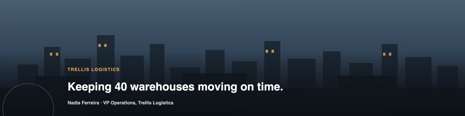
Nadia Ferreira's banner for Trellis Logistics uses an illustrated skyline of warehouse blocks as a backdrop, darkened by a bottom-to-top gradient so a text band along the lower third stays readable. The image signals "logistics, operations, scale" before a single word is read, which a pure text banner cannot do as fast. The gradient overlay does the contrast job here: without it the lighter sky behind the skyline would swallow the text.
This pattern suits operations, real estate, logistics, and hospitality roles where a place or a physical environment is part of the story. It takes the most work to build of the 9 patterns here, because the overlay strength has to be tuned by eye until the text clears the background at both the desktop and the mobile crop.
6. The minimalist icon row
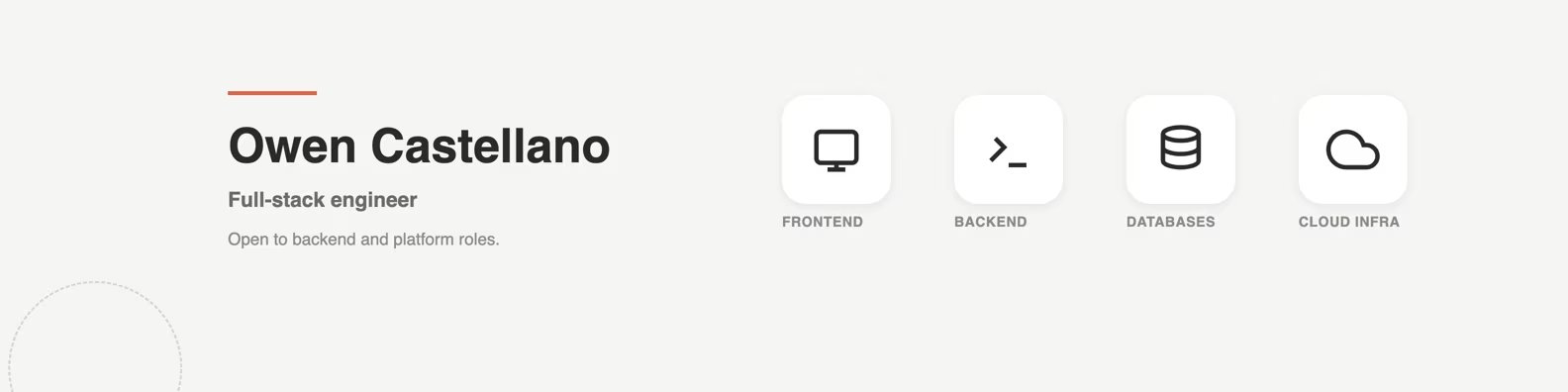
Owen Castellano's banner shows 4 line icons, representing frontend, backend, databases, and cloud infrastructure, in a single row to the right of his name and title on a plain light ground. The icons act as a visual table of contents for his skill set, readable without a paragraph of text. Hierarchy runs left to right: name first, title second, then the icon row, each element quieter than the one before it.
This pattern suits engineers, designers, and other roles where the toolkit itself is the pitch. It is the simplest of the 9 patterns to keep current: swapping one icon for another takes less editing than rewriting a sentence.
7. The logo wall
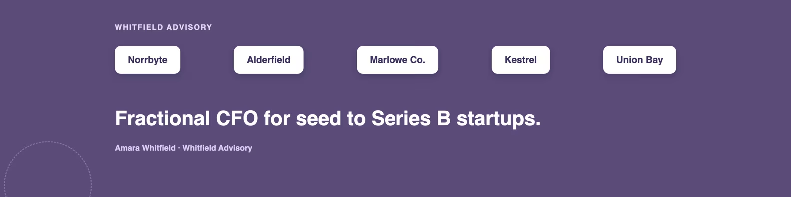
Whitfield Advisory's second banner swaps the quote for a row of 5 wordmark chips, standing in for past clients, above a single line reading "Fractional CFO for seed to Series B startups." The logo row borrows credibility the same way a case study section does: it lets other names vouch for you before you say a word about yourself. Contrast comes from the chips sitting on white cards against a colored ground, which keeps 5 different wordmarks from turning into visual noise.
This is the same person as the quote-led example above, a reminder that one person can use different patterns for different goals: a quote when the point is a belief, a logo wall when the point is proof. It suits consultants, agencies, and freelancers whose client list is their main asset.
8. The before-after transition
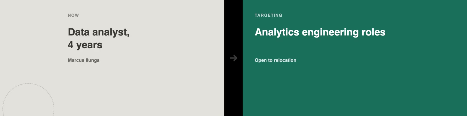
Marcus Ilunga's second banner splits the canvas into a muted left panel labeled "Now: data analyst, 4 years" and a saturated teal right panel labeled "Targeting: analytics engineering roles," with an arrow connecting the two. Unlike the split-panel headshot pattern above, the split here is conceptual, showing a timeline, not a photo layout. The color shift from left to right is the contrast device: the eye reads it as forward motion before parsing the words.
This pattern is built for a job search or a visible pivot: it says what you are targeting next, which a generic "open to work" banner does not. It works only when the target on the right is specific, so a named job family beats a vague "new opportunities."
9. The topic-pill creator banner
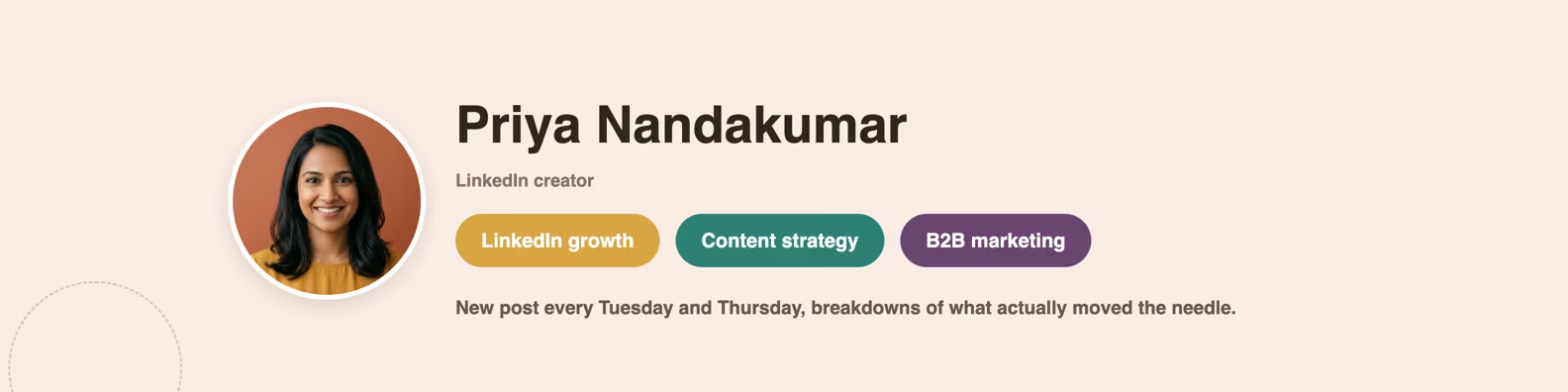
Priya Nandakumar's banner pairs her name and a small circular headshot with 3 rounded pill badges reading "LinkedIn growth," "content strategy," and "B2B marketing." The pills work like a menu: a visitor decides in one glance whether your content matches what they came for. Hierarchy runs name first, headshot second, pills third, each pill sized identically so no single topic reads as more important than the others.
This pattern is built for creators and anyone growing an audience on the platform, where "what do you post about" is the first question a new follower asks. It breaks down if your content drifts outside the 3 topics shown, so revisit it every few months rather than treating it as a one-time asset.
Pick the pattern that matches your role
No single pattern is the best LinkedIn banner for everyone: the right one depends on what you need to prove in the first glance a visitor gives your profile. The table here maps 6 common roles to the pattern that fits them, and the one reason why.
| Role | Best pattern | Why |
|---|---|---|
| Consultant or agency owner | Quote-led (2) or logo wall (7) | A belief or a client list builds trust faster than a job title alone, and both patterns work from the same person, so you can rotate them. |
| Founder | Bold one-line statement (1) | A founder's banner has one job, stating what the company does, in the fewest possible words. |
| Recruiter | Stat-led proof (3) | A single credible placement number does more convincing than a paragraph about your process. |
| Job seeker | Split-panel headshot (4) or before-after (8) | Job seekers benefit from warmth and a specific target, a face builds trust, a named next role focuses the search. |
| Creator | Topic-pill banner (9) | New followers decide to stay or scroll past based on whether your topics match what they came for. |
| Salesperson or account executive | Stat-led proof (3) or split-panel headshot (4) | A number proves outcomes and a face warms up a cold outreach, so pick the one your prospects respond to before you send the next connection request. |
Two roles are missing on purpose: engineers and operations leaders, because pattern 6 (icon row) and pattern 5 (workspace backdrop) already name them in their own breakdowns above. If your role does not fit one row, start from the pattern whose trade-off you can live with, not the one that looks most impressive in isolation. A student or first-time job seeker follows the job-seeker row: a named target role on the before-after pattern says more than a degree alone.
A banner is one piece of a bigger first impression: the headline, the about section, and the featured posts around it get read in the same glance. If you are reworking more than the banner, Taplio's LinkedIn profile optimization tool reviews the headline, about section and featured posts, so the banner and the text around it tell the same story.
Where to get the photo, quote or text for your banner
Every pattern above needs one of three raw materials: a photo or illustration, a quote, or a short line of positioning text, and each has a legitimate source. For a photo or illustrated backdrop like the workspace pattern, use a stock library that grants commercial use rather than an image pulled from a search result, since you do not hold the rights to reuse the latter.
For the quote-led or pill-badge patterns, start from your own past LinkedIn posts or comments: the sharpest line you have written about your work probably exists in your history. If nothing fits, the 80+ LinkedIn banner quotes list linked from the quote-led design earlier gives a shortcut. For the icon row, take all 4 icons from one icon set so the stroke weight matches, since mixed sets read as four banners stitched together.
If you would rather start from a finished layout than build one of these 9 patterns from a blank canvas, Taplio's LinkedIn banner templates guide has 6 ready templates plus a Canva walkthrough, each editable in a few minutes.
Banner size and safe zone, in brief
Every banner in this gallery renders at 1584 by 396 pixels, LinkedIn's banner size, and every one keeps the bottom-left corner clear. That clear zone matters because your circular profile photo sits on top of the banner in that corner on desktop, so any text or face placed there gets partly covered the moment the page loads.
That is the whole size discussion here on purpose. For the full pixel breakdown across desktop and mobile, plus file size and format limits, see Taplio's LinkedIn post image size guide, which owns that spec in depth so this page does not repeat it.
Frequently asked questions
What is an ideal LinkedIn banner?
An ideal LinkedIn banner passes 3 checks: a single dominant element establishes hierarchy, that element contrasts with everything around it, and the whole banner carries one message. The 9 patterns in this gallery each pass those 3 checks in a different way, so there is no single ideal layout for every role.
What should I avoid in a LinkedIn banner?
Avoid placing text, a logo, or a second face in the bottom-left corner of the canvas, since your circular profile photo overlaps that corner on desktop and will cover it. Avoid cramming more than one message onto the banner, and avoid a stat or client claim you cannot back up if someone asks.
How to get a high quality LinkedIn banner?
Build at the full 1584 by 396 pixel size rather than upscaling a smaller image, since an upscaled source turns blurry once LinkedIn resizes it. Pick one pattern from this gallery, keep the bottom-left corner clear, and export as a PNG or JPG at that full size.
What is the recommended size for LinkedIn banners in 2026?
The recommended size is 1584 by 396 pixels for a personal profile banner, the size every banner in this gallery is rendered at. Mobile crops the same upload differently, so the size and safe zone section here covers the desktop view, and Taplio's post image size guide covers the full mobile breakdown.


Keep reading
All articlesRelated Articles
.avif)
Your Linkedin AI coach is waiting for you
Join 12,000+ creators who let their coach turn the blank page into a plan and watch their audience compound.
7-day free trial · 30 day money back · Cancel anytime
AVG. VIEWS
2,979
-1.5%
ENGAGEMENT
3.2%
+0.8%

Free Monthly Report
How does your LinkedIn compare?
Get free monthly benchmarks on reach, engagement, and content format performance.
Get the Benchmark