
Pricing


AI writer
Taplio
MCP V2
New: Engage tools
Taplio MCP V2 now available, try it out
Your AI can now comment and reply for you. It finds the posts worth engaging, drafts in your voice and queues them on your Taplio account. Nothing posts until you confirm.

LinkedIn banner: ideas, examples and how to make one


10
min read

 Open in ChatGPT
 Open in Claude
 Open in Perplexity
Key Takeaways
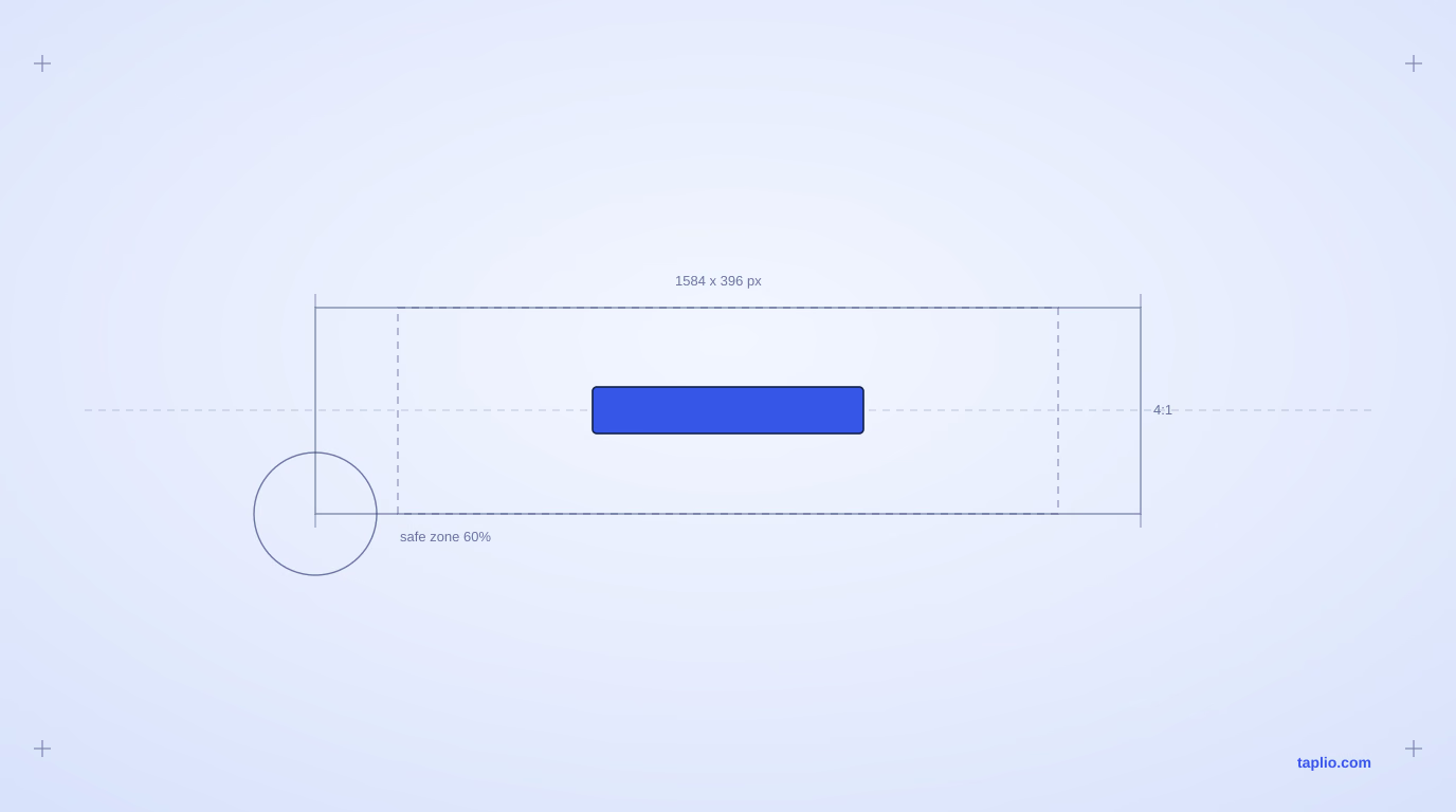
- The personal profile banner canvas is 1584 x 396 pixels, a 4:1 ratio. Design at full size and export as JPG or PNG, because LinkedIn stretches anything smaller and the blur shows immediately.
- One message per banner is the rule that separates the good ones from the busy ones. A visitor looks at the top of a profile for a second or two, so a banner carrying three ideas communicates none of them.
- The safe zone matters more than the pixel size. Your profile photo covers the bottom left corner on desktop and the LinkedIn mobile app trims the outer edges, so keep text and logos toward the middle.
- Nine patterns cover almost every profile, from a solid brand color with one line of text to a product shot, a result, a team photo, or an event countdown. Pick the one matching what you want a visitor to do next.
- The banner earns the second look, the rest of the profile converts it. Pair it with a headline and About section that carry the same message, or the attention it wins leaks away.
A good LinkedIn banner uses the space above your profile photo to say, in one glance, who you help and how. The right size is 1584 x 396 pixels, and the fastest path to a good one is picking a single message, one of the idea patterns below, and a tool that exports at that exact size.
What makes a good LinkedIn banner
A good LinkedIn banner does one job and does it clearly: it states who you help, what you offer, or what you stand for, in a single message placed where it will not be covered or cropped. Banners that try to say three things at once say nothing, because a viewer only looks at the top of a profile for a second or two before scrolling to the headline.
Three things separate a banner that works from one that gets ignored. It carries one clear idea, not a mood board of logos and taglines. It keeps that idea inside the safe zone, away from the bottom left corner where your profile photo sits and away from the outer edges LinkedIn trims on mobile. And it uses enough contrast that the message reads at a glance, even as a thumbnail in someone's notification feed.
LinkedIn banner ideas that work
Most working banners fall into one of these patterns. Pick the one that matches what you actually want a profile visitor to do next, rather than combining several.
- Solid brand color with one line of text. No photo, no icons, just your brand color and a short statement of what you do. The easiest pattern to execute well because there is nothing to clutter.
- A quote that reflects how you work. One sentence, centered, in the safe zone, and our roundup of LinkedIn banner quotes is a good place to find one. Works best when the line is something you would actually defend, not a generic hustle quote.
- A product or offer screenshot. Useful for founders and consultants: show the thing you sell, cropped tightly, with a short line of context next to it.
- A before and after or a result. A chart, a stat, or a side by side that proves the outcome you deliver. Strong for anyone whose work is measurable.
- A behind the scenes photo. You at work, your team, or your workspace. Humanizes a profile that otherwise reads as a wall of text.
- An event or launch countdown. Useful for a limited window: a webinar, a book launch, a conference talk. Swap it out once the date passes so the banner does not go stale.
- A testimonial or proof point. A short client quote or a number, such as years of experience or clients served, placed where it reinforces your headline rather than repeating it.
- A simple pattern or illustration. Geometric shapes, line art, or a subtle texture in your brand colors. Works when you want a banner that looks designed without needing a photo.
- A skyline or location photo. A clean shot of a city at sunrise or dusk, paired with your name or role. Common for people whose location or market is part of their pitch.
| Banner pattern | Best for | What to put on it |
|---|---|---|
| Solid brand color with one line | Consultants, job seekers | One outcome, stated plainly, no photo |
| A quote you would defend | Coaches, thought leaders | One sentence, centered in the safe zone |
| Product or offer shot | Founders, creators | The thing you sell, cropped tight, short context line |
| A result or before and after | Anyone whose work is measurable | One number and what it means |
| Team or workspace photo | Agencies, recruiters | Faces plus the niche the business serves |
Whichever pattern you pick, treat the banner as one message rather than a second About section. If you need to explain it, it is doing too much.
LinkedIn banner examples worth studying
A few concrete patterns show how these ideas play out in practice.
A consultant banner that works usually pairs a plain brand-color background with a single outcome-driven line, something like the specific result clients get, rather than a job title. It skips a photo entirely so the text stays the only focus.
A recruiter or agency banner that works often shows the team, three or four small headshots or a group photo, next to the agency name and the niche it serves. This turns an individual profile into a signal for the whole business behind it.
A creator or coach banner that works tends to use a product shot, a book cover, a course screen, or a community screenshot, with a short line naming who it is for. It functions like a landing page hero image rather than decoration.
A job seeker banner that works is usually the simplest of all: a solid color and one honest line about what kind of role they want next. It avoids anything that looks like it is trying too hard, which reads better to hiring managers skimming dozens of profiles.
LinkedIn banner size and the safe zone
The personal profile banner is 1584 x 396 pixels, a 4:1 ratio, saved as a JPG or PNG. A LinkedIn Company Page cover image uses a different, shorter ratio. Whatever size you design at, keep your text and logo inside the middle of the canvas: LinkedIn's mobile app trims the outer edges, and on desktop your profile photo covers the bottom left corner. Design at the full canvas size rather than a smaller image LinkedIn will stretch, since a stretched banner looks blurry immediately.
For the complete set of dimensions, including Company Page and event covers, and a full safe zone diagram, see the LinkedIn banner size guide, which keeps every current spec in one place so this page does not duplicate them.
How to make a LinkedIn banner in 5 steps
- Pick one message. A single value proposition, a quote, or a proof point. Write it down before opening a design tool.
- Open a canvas at 1584 x 396 pixels. Canva, Figma, and most free design tools have a LinkedIn banner preset at this exact size, so you do not need to set it manually.
- Design inside the safe zone. Keep text and logos in the center 60 percent of the width and clear of the bottom left corner.
- Check contrast and export. Dark text on a light background, or the reverse. Export as a JPG or PNG.
- Upload it from your profile. Click the pencil icon on your current banner, upload the new image, adjust the crop, and apply.
Personal profile banner vs Company Page cover
A personal profile banner and a Company Page cover are not interchangeable, and reusing one design for both is the fastest way to end up with something cropped badly. The personal banner is 1584 x 396 pixels and sits behind an individual's photo and headline. The Company Page cover is shorter and wider, sits behind the page's logo and follow button, and gets cropped more aggressively on smaller screens.
If you manage both a personal profile and a Company Page, design each on its own canvas at its own size. A logo or tagline that reads clearly on a personal banner will often sit too close to the edge on a Company Page cover, where LinkedIn trims more of the frame on mobile.
LinkedIn banner mistakes to avoid
- Stretching a small image. Uploading anything smaller than the recommended canvas and letting LinkedIn scale it up produces a blurry banner every time.
- Putting text in the corners. The bottom left is covered by your profile photo on desktop, and the outer edges are trimmed on the mobile app.
- Combining more than one message. A banner with a logo, a tagline, a quote, and a call to action all at once reads as noise, not a message.
- Low contrast text over a busy photo. If the text is not readable as a thumbnail, it will not be read at full size either.
- Never updating it. A banner promoting an event that already happened, or a role you no longer hold, quietly signals that the profile is not maintained.
Pair your banner with a profile that actually converts
A strong banner earns a second look, but it is the headline, About section, and recent posts that turn that look into a follow or a reply. Once your banner is set, run the rest of your profile through a full LinkedIn profile optimization pass, and use a headline generator so the line under your name matches the message your banner just made.
If you want to see what is actually working across your niche before you finalize a banner, the LinkedIn Benchmark, built from more than 200,000 posts analyzed monthly, is a useful sanity check on what serious profiles in your space are doing.
Frequently asked questions
What size should a LinkedIn banner be?
A personal profile banner should be 1584 x 396 pixels, a 4:1 ratio, saved as a JPG or PNG. A Company Page cover image uses a different, shorter ratio, so do not reuse the same file for both.
Can I put text on my LinkedIn banner?
Yes, and a short line of text, a value proposition or a quote, is one of the most effective banner patterns. Keep it under about 10 words, centered, and inside the safe zone so it is not cropped on mobile or covered by your profile photo.
Do I need a LinkedIn banner?
LinkedIn shows a default banner if you never upload one, which wastes the most visible space on your profile. Replacing it costs a few minutes and gives you a spot to state your value proposition before a visitor even reaches your headline.
What is the difference between a LinkedIn banner and a Company Page cover image?
A personal banner is 1584 x 396 pixels and sits behind an individual profile photo and headline. A Company Page cover image uses a shorter, wider ratio and sits behind the page logo and follow button. Designs do not transfer cleanly between the two.
How do I remove or change my LinkedIn banner?
Open your profile, click the pencil or camera icon on the existing banner, and either upload a new image or remove the current one. LinkedIn will prompt you to adjust the crop before applying the change.
What image size works best for a LinkedIn banner on mobile?
The file size does not change for mobile, but the visible area does. LinkedIn trims the outer edges of the 1584 x 396 canvas on its mobile app, so keep text and logos inside the center of the image rather than near the left or right edge.


Keep reading
All articlesRelated Articles
.avif)
Your Linkedin AI coach is waiting for you
Join 12,000+ creators who let their coach turn the blank page into a plan and watch their audience compound.
7-day free trial · 30 day money back · Cancel anytime
AVG. VIEWS
2,979
-1.5%
ENGAGEMENT
3.2%
+0.8%

Free Monthly Report
How does your LinkedIn compare?
Get free monthly benchmarks on reach, engagement, and content format performance.
Get the Benchmark