
Pricing


AI writer

Taplio
MCP V2
New: Engage tools
Taplio MCP V2 now available, try it out
Your AI can now comment and reply for you. It finds the posts worth engaging, drafts in your voice and queues them on your Taplio account. Nothing posts until you confirm.

LinkedIn banner templates: 6 patterns you can copy


10
min read

 Open in ChatGPT
 Open in Claude
 Open in Perplexity
Key Takeaways
- LinkedIn banner template: A LinkedIn banner template is a pre-sized 1584 x 396 pixel layout (4:1 ratio), and the highest-performing pattern is the one-claim template, a single readable sentence on a flat colour field, which takes about ten minutes to build.
- Where to get one free: Canva ships hundreds of LinkedIn banner layouts at the correct preset on its free tier (catch: popular layouts are recognisable), Figma Community offers free editable banner files published by designers (catch: it assumes Figma skills), and a blank canvas at 1584 x 396 costs nothing and beats most templates.
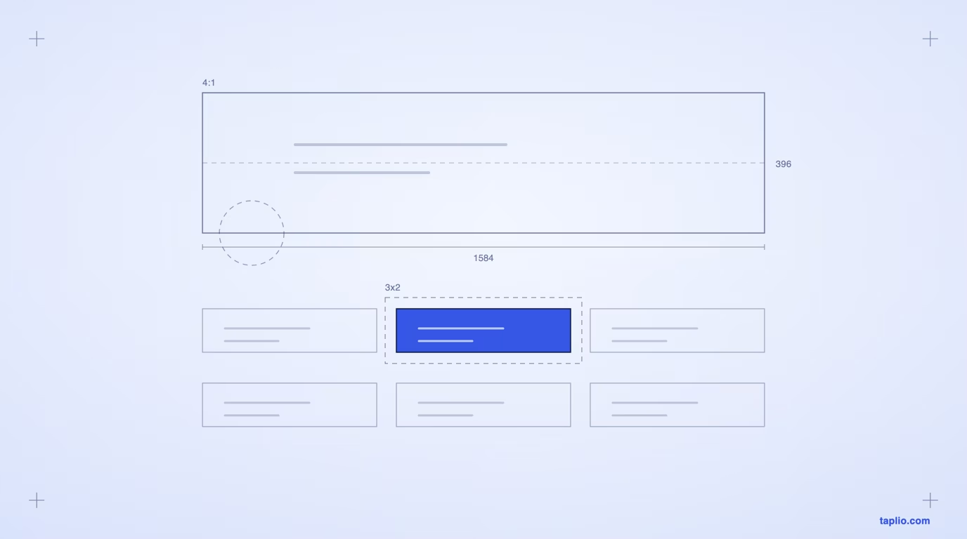
- The figure that decides layout: On desktop the profile photo overlaps roughly the first 250 pixels from the left plus the bottom two thirds of the banner height, so that zone is lost, while LinkedIn Help publishes only the company Page cover spec of 1512 x 256 pixels, PNG or JPEG under 3MB.
- Check before exporting: Confirm the canvas is exactly 1584 x 396 with no upscaling, the lower left is clear, the copy is one sentence in at most two type sizes, contrast holds at thumbnail size, and the file is PNG or JPEG under the 3MB cap.
- Decision rule: Choose the one-claim pattern if you have a sentence only you could write, proof as a number if you have a metric you can defend in one line, the logo wall if you have up to five recognisable client logos, and quiet texture if the headline already does the work.
A LinkedIn banner template is a pre-sized 1584 x 396 pixel layout you drop your own words and colors into. Canva, Figma and most design tools ship hundreds of them free, and any of them will work technically. What decides whether yours earns anything is the pattern you pick, not the tool. This page shows six patterns rendered at full banner size, maps the zone LinkedIn covers up on desktop, and lists what to avoid.
What size is a LinkedIn banner?
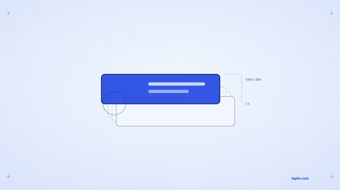
A personal LinkedIn banner is 1584 x 396 pixels, a 4:1 ratio. That is the preset every design tool uses and the size the profile renders at.
Worth knowing before you trust any number you read on this subject: LinkedIn does not publish a figure for personal profile banners in its help centre. What it does publish is the spec table for company Pages, where the cover image is 1512 x 256 pixels, all images must be PNG or JPEG, and the file cap is 3MB.
| Asset | Size | Source |
|---|---|---|
| Personal profile banner | 1584 x 396 px (4:1) | Tool presets and rendered profile, not published by LinkedIn |
| Company Page cover | 1512 x 256 px | LinkedIn Help, Pages image specifications |
| Company Page logo | 400 x 400 px recommended, 268 x 268 minimum | LinkedIn Help, Pages image specifications |
| File format and cap | PNG or JPEG, 3MB maximum | LinkedIn Help, Pages image specifications |
Export at exactly 1584 x 396 rather than letting a tool scale up from something smaller. Upscaling is where banners go soft, and a blurry banner reads as carelessness before anyone has read a word of it. Our full guide to LinkedIn banner sizes covers the mobile and tablet crops in more detail.
Six LinkedIn banner templates you can copy
Every template that works is one of a handful of patterns. Here are six, each rendered at the real 1584 x 396 so you can judge them at the size they will actually appear. Each one demonstrates a single idea, and each names what it costs you.
Rebuild any of these in Canva in about ten minutes. The words matter more than the layout, so write those first.
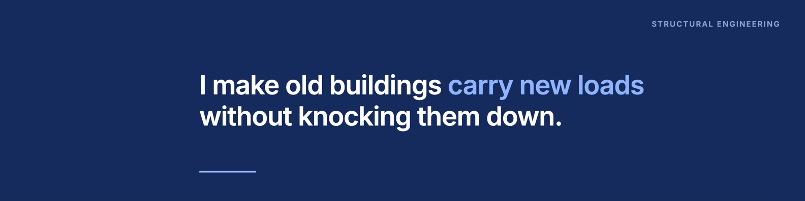
Pattern 1, one claim. A single sentence on a flat color field. This is the highest-performing pattern for most people and the least used, because it feels too plain to make. It is not plain, it is legible, which is the only thing a banner has to be at 200 pixels tall on a phone.
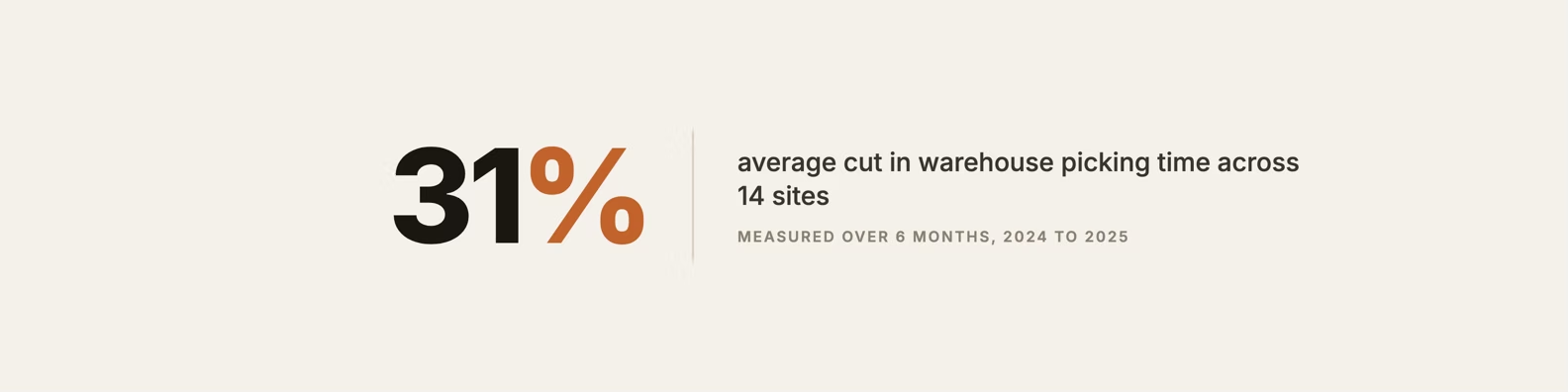
Pattern 2, proof as a number. One metric set large, with a one-line qualifier so the number means something. Use this when you have a number you can defend. Do not use it if the number needs a paragraph of context, because the banner does not have a paragraph.
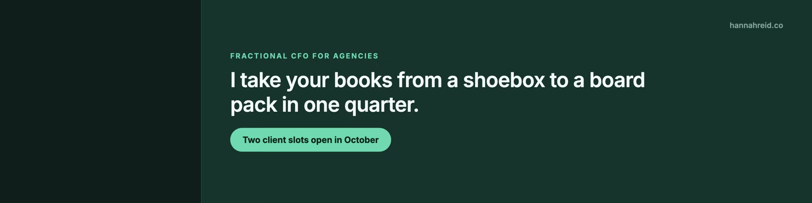
Pattern 3, the offer strip. What you do, who it is for, and one call to action. The most commercial of the six, and the one that ages fastest, since you have to update it whenever your availability changes. Only run this if you will maintain it.
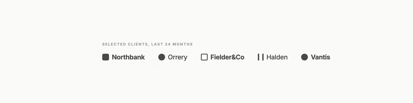
Pattern 4, the logo wall. Social proof by association, with no sentence at all. Powerful for consultants and freelancers, and worthless if the logos are not recognisable to the specific person you want to impress. Five is the ceiling. Beyond that they turn into texture.
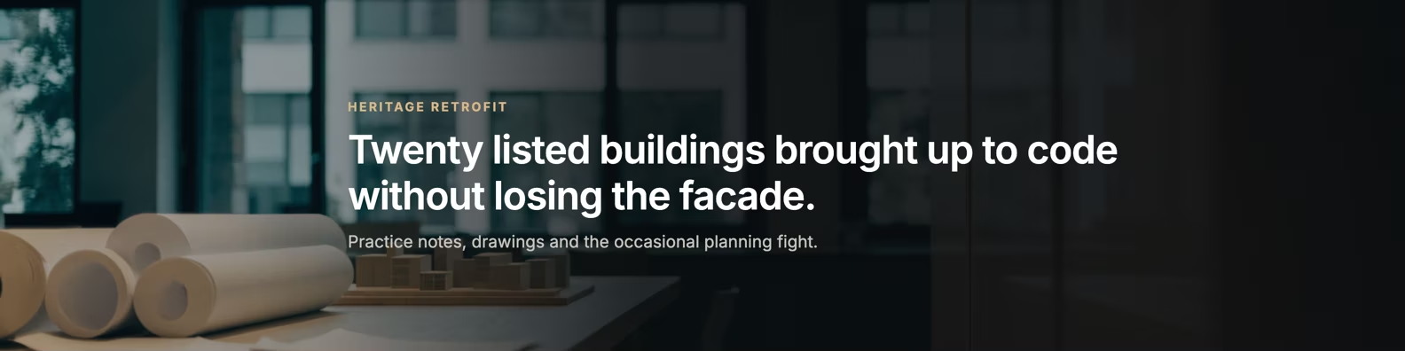
Pattern 5, the photo band. A photograph with a dark scrim behind the text so the words stay readable. This is where most homemade banners fail: the photo wins, the text disappears, and the banner communicates nothing. If you use a photo, the scrim is not optional.
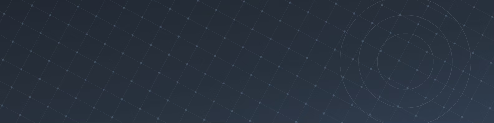
Pattern 6, quiet texture. A pattern field with no message at all. The right choice when your headline already does the work and you want the profile to feel considered rather than sold. It says nothing, deliberately, and that is a valid decision rather than a missed opportunity.
The safe zone: where LinkedIn covers your banner
Your profile photo sits on top of the lower left of your banner on desktop, and your name card covers the bottom edge. Anything you put there is hidden, which is why so many carefully centred banners look broken on a real profile.
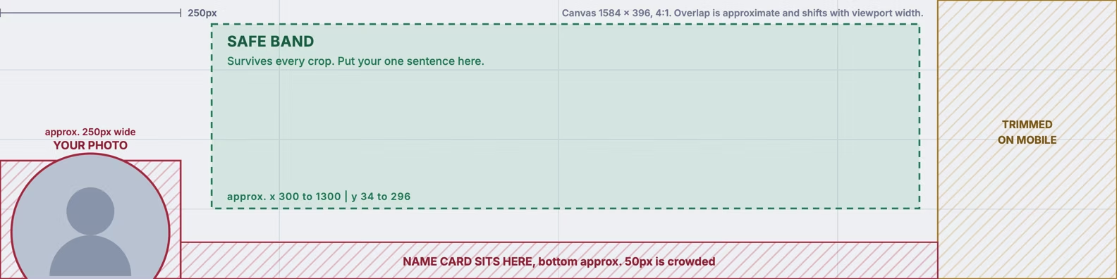
Two rules follow from this, and they cover most of the damage.
Keep the lower left clear. On desktop the profile photo overlaps roughly the first 250 pixels from the left and the bottom two thirds of the banner height. Put nothing there you need read.
Keep your message in the upper left or the centre. That band survives every crop. The far right is safe on desktop but gets trimmed on narrow mobile viewports, so treat it as decoration rather than a place for words.
LinkedIn gives the same advice for company Pages in its own documentation, telling Page owners to place key details away from the edges, especially the lower right corner, and to centre important information because images crop differently across screen sizes.
What to avoid in a LinkedIn banner
Most bad banners fail for one of five reasons, and all five are avoidable in the ten minutes it takes to make one.
Text in the lower left. The single most common mistake. Your profile photo is sitting on it.
Too many words. A banner is read in about a second, at a glance, often on a phone. One sentence is the budget. Two is pushing it. A paragraph is invisible.
Low contrast. Pale text on a photograph, or a mid-grey on mid-blue. If you have to concentrate to read it at thumbnail size, nobody will.
Stock imagery with no point. A generic city skyline or a handshake says you filled a space. It is worse than a plain color field, because it costs attention and returns nothing.
Contact details. An email address and a phone number in a banner date instantly, cannot be clicked, and are already available in your contact info. Skip them.
If your banner is doing the job, the rest of the profile has to hold up too. Our notes on LinkedIn profile optimization cover the headline and about section that sit directly underneath it.
How to use these templates in Canva
Canva is a good choice for LinkedIn banners because it has the 1584 x 396 preset built in, which removes the one step people get wrong. Search its template library for LinkedIn banner, or start from a blank canvas at that size.
The sequence that produces something usable rather than something generic:
Start from a blank canvas, not a template. Templates pull you toward decoration. Set the canvas to 1584 x 396, write your one sentence, then add only what the sentence needs.
Block out the profile photo zone first. Draw a rectangle over the lower left before you place anything, so you physically cannot put text there. Delete it before exporting.
Use two type sizes at most. One for the message, one for the qualifier. Three sizes in a 396 pixel strip reads as noise.
Export as PNG at 1584 x 396. Do not export at 2x and let LinkedIn downscale. Do not export a JPEG at low quality to save a few hundred kilobytes when the cap is measured in megabytes.
Where else to find free LinkedIn banners
Canva is the default, but it is not the only source, and each option has a different catch worth knowing before you spend an hour in it.
| Source | What you get | Cost | The catch |
|---|---|---|---|
| Canva | Hundreds of LinkedIn banner layouts at the right preset | Free tier covers it | Popular layouts are recognisable, so you will share yours with thousands of people |
| Figma Community | Editable banner files published by designers | Free | Assumes you can drive Figma |
| Your own brand assets | A color, a typeface, a mark you already own | Free | Requires you to already have them |
| A blank canvas | One sentence on a solid color | Free | None, and it beats most templates |
The uncomfortable truth about template galleries is that the best-looking template is also the most-used one. If you want a banner nobody else has, the fastest route is a solid color and a sentence only you could write. If you would rather borrow words than write them, our collection of LinkedIn banner quotes is a starting point, and our guide to LinkedIn banner ideas covers more angles.
Frequently asked questions
Is Canva good for LinkedIn banners?
Yes. It has the 1584 x 396 preset built in, a free tier that covers everything you need for a banner, and export settings that will not degrade the file. The limitation is not quality, it is sameness: the most attractive templates are used by very large numbers of people, so a heavily styled Canva banner is recognisable as one.
Does Canva have templates for banners?
Yes, several hundred for LinkedIn specifically, plus separate libraries for web banners and other platforms. They are searchable by keyword and colour and most are available on the free tier. Check the canvas size before you start, because the LinkedIn personal banner preset and the company Page cover preset are different sizes.
What is the best banner template for LinkedIn?
The one-claim pattern: a single readable sentence on a flat colour field. It survives every crop, works at phone size, costs ten minutes, and does not look like a template. It is the first of the six patterns shown above. The best template for you specifically is whichever pattern matches the proof you actually have, which is why the six are labelled by what they cost as well as what they do.
What should I avoid in a LinkedIn banner?
Five things: text in the lower left where your profile photo covers it, more than one sentence, low contrast between text and background, generic stock imagery, and contact details. The lower left mistake is by far the most common and the easiest to fix.
What size is a LinkedIn banner?
1584 x 396 pixels for a personal profile, a 4:1 ratio, exported as PNG or JPEG. Company Page covers are a different size, 1512 x 256 pixels according to LinkedIn's Pages documentation, with a 3MB file cap. Note that LinkedIn publishes the Page figure but does not publish one for personal banners.
Where can I download free LinkedIn banners?
Canva and the Figma Community both offer free, editable LinkedIn banner files, and neither requires a paid plan for this use. Both are better used as a starting layout than as a finished asset, because a downloaded banner with someone else's words on it does nothing for you. The fastest route to something distinctive is a solid colour and one sentence you wrote.


Keep reading
All articlesRelated Articles
.avif)
Your Linkedin AI coach is waiting for you
Join 12,000+ creators who let their coach turn the blank page into a plan and watch their audience compound.
7-day free trial · 30 day money back · Cancel anytime
AVG. VIEWS
2,979
-1.5%
ENGAGEMENT
3.2%
+0.8%

Free Monthly Report
How does your LinkedIn compare?
Get free monthly benchmarks on reach, engagement, and content format performance.
Get the Benchmark