
Pricing


AI writer

Taplio
MCP V2
New: Engage tools
Taplio MCP V2 now available, try it out
Your AI can now comment and reply for you. It finds the posts worth engaging, drafts in your voice and queues them on your Taplio account. Nothing posts until you confirm.

LinkedIn carousel size: the specs and examples that work

September 16, 2026

8
min read

 Open in ChatGPT
 Open in Claude
 Open in Perplexity

Key Takeaways
- The recommended size: Build a LinkedIn carousel at 1080 x 1350 px for portrait or 1080 x 1080 px for square, a design-tool convention, since LinkedIn publishes no pixel spec for document posts.
- The official file limits: LinkedIn's Help pages cap a document post at 100 MB and 300 pages, verified directly on linkedin.com/help.
- The file format: PDF is LinkedIn's recommended format, though PPT, PPTX, DOC and DOCX are also accepted for a carousel upload.
- The slide count: LinkedIn sets no minimum and a 300 page maximum per document, so the usual 6 to 10 slide carousel is a creator convention, not a platform rule.
- The ad spec is different: A LinkedIn carousel ad follows its own rules, 2 to 10 cards at a recommended 1080 x 1080 px and a 10 MB per card limit, separate from the organic document post spec.
The best LinkedIn carousel size is 1080 x 1350 px for a portrait document post, or 1080 x 1080 px if you want a square that also works as a standalone image. LinkedIn itself does not publish a pixel spec for document posts, only a 100 MB file size limit and a 300 page maximum, so the dimensions below are the standard the major design tools have converged on. This guide gives you the verified specs, the ratio to pick, and three carousel examples broken down slide by slide.
LinkedIn carousel size and specs
The LinkedIn carousel size to build for is 1080 x 1350 px for portrait or 1080 x 1080 px for square, exported as a PDF. Both ratios upload as a single document post, not a series of separate images, so LinkedIn treats a carousel exactly like any other document.
| Setting | Value | Source |
|---|---|---|
| Square ratio | 1080 x 1080 px (1:1) | Design-tool consensus, not published by LinkedIn |
| Portrait ratio | 1080 x 1350 px (4:5) | Design-tool consensus, not published by LinkedIn |
| Landscape ratio | No fixed pixel spec, avoid it on a mobile-first feed | LinkedIn does not document a landscape carousel size |
| File format | PDF recommended, PPT, PPTX, DOC and DOCX are also accepted | LinkedIn Help, verified |
| Max file size | 100 MB | LinkedIn Help, verified |
| Max length | 300 pages | LinkedIn Help, verified |
| Minimum slides | None stated by LinkedIn, only the 300 page maximum | LinkedIn Help, no minimum listed |
| Documents per post | 1 | LinkedIn Help, verified |
Keep every slide at the same pixel size. LinkedIn's own upload guidance says PDFs with pages of different sizes must be fit to one page size before upload, so a mixed file is a spec violation, not a style choice.
Square or portrait: which ratio to choose
Choose portrait, 4:5, when you want the carousel to take up the most vertical space in the feed. Choose square, 1:1, when the same file might get reused as a standalone image, since a square crops cleanly on both mobile and desktop.
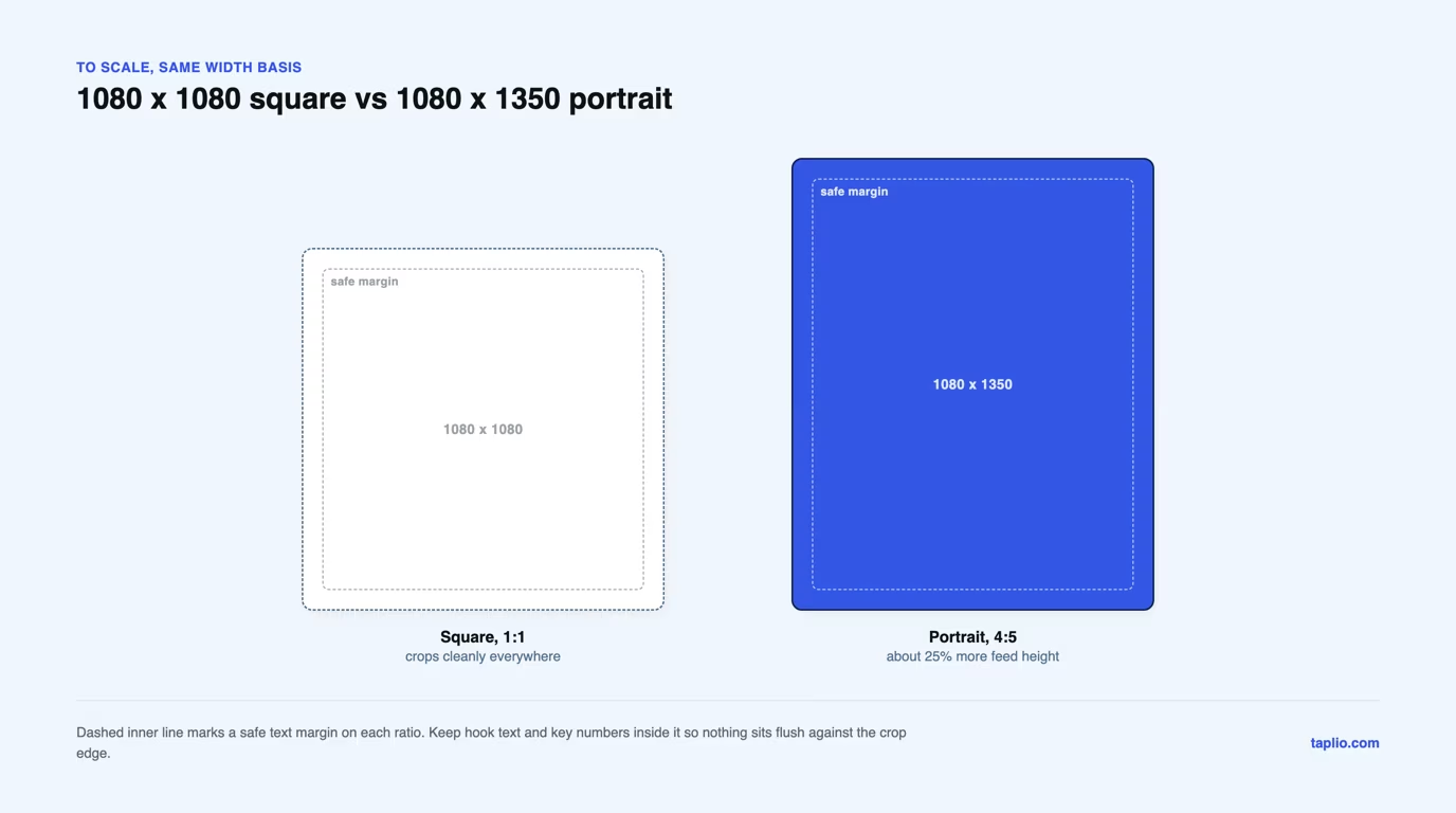
Portrait takes more of the screen because the feed renders a document at the width of the column, so a 4:5 page is 25 percent taller than a 1:1 page at the same width, exactly the difference drawn above. Square is the safer pick for a carousel you also want to crop into a single post image later, because nothing gets cut off top or bottom, the same logic covered in our LinkedIn post image size guide.
How many slides to use
Plan on 6 to 10 slides, the range working creators settle on, since LinkedIn sets no minimum and no maximum other than its 300 page ceiling. The number is a content convention, not a platform rule, so treat it as a default to adjust rather than a limit.
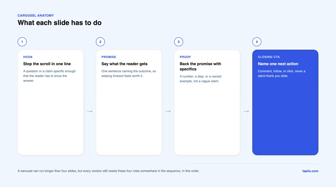
Fewer than 4 slides leaves no room for the four roles shown in the next section: hook, promise, proof and closing CTA. Past 10, every extra slide is one more chance to swipe away, so add a slide only when it carries a proof point the carousel would be weaker without.
LinkedIn carousel examples that work
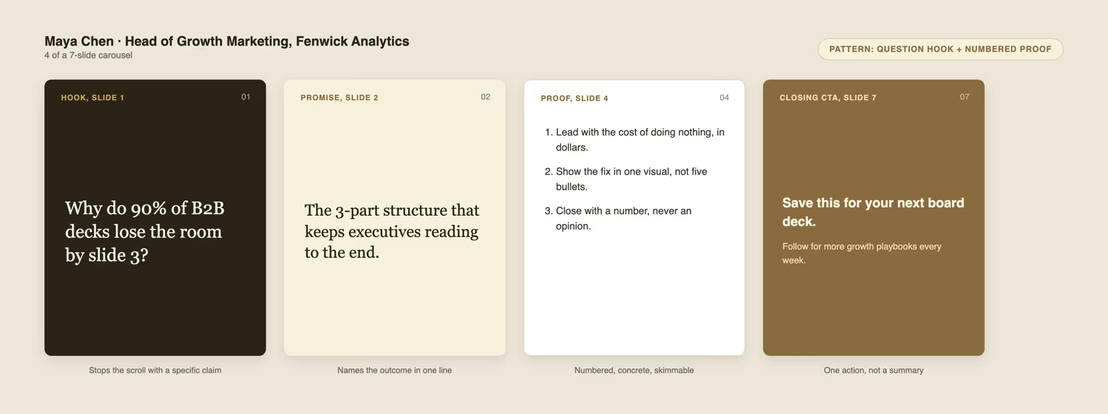
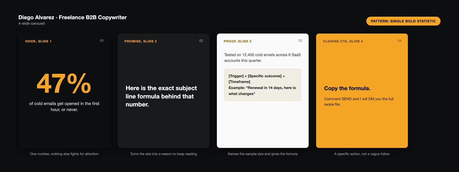
A carousel that works gives every slide one job: hook, promise, proof, then a closing CTA. Skip a role and the carousel either opens weak or ends with nothing for the reader to do next.
The three examples below each demonstrate one pattern for filling that structure, drawn at the 4:5 portrait ratio with the four key slides of each carousel side by side, so you can copy the layout directly.
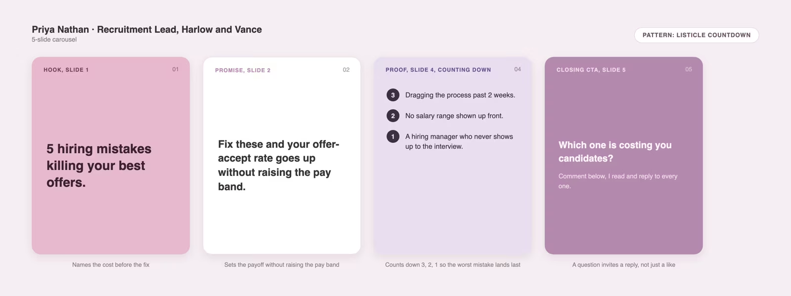
How to create and publish a LinkedIn carousel
Build your slides at 1080 x 1080 or 1080 x 1350 px in the design tool of your choice, keeping every slide the same size. Taplio's free carousel generator builds a correctly sized PDF from your text automatically, or you can export one from any design tool yourself.
Export the finished file as a single PDF, since LinkedIn's Help page asks you to convert to PDF whenever possible for the highest quality upload. Taplio's carousel tool also handles this export step for you if you write your content inside it.
Open LinkedIn and click Start a post, then click More and choose the Add a document icon. Select your PDF, add a title, which LinkedIn requires, click Done, then write your post text and click Post.
The title you add is not optional decoration. It is what shows in the feed before anyone opens the document, so it carries the same weight as your hook slide.
Mistakes to avoid
The most common mistake is text sized for a desktop screen. The feed shows your document at a fraction of its export size, so check every slide on a phone before posting and enlarge anything you have to squint at.
The second is a final slide with no CTA. A carousel that ends on a summary or a thank you gives the reader nothing to do, which wastes every swipe it took to get them there.
A third is mixed page sizes or embedded animation inside one file. LinkedIn's upload guidance requires every page to be fit to the same size and displays any video or animation as a static image, so build the deck uniform and static, the same size discipline our LinkedIn banner size guide applies to profile covers.
A fourth is publishing before proofreading. LinkedIn lets you edit a document post's title and description afterwards but not the document itself, so a typo on slide 3 means deleting the post and starting over.
Carousel posts vs carousel ads: different specs
A LinkedIn carousel post and a LinkedIn carousel ad use two separate spec sheets, and mixing them up is an easy way to build the wrong file. The organic document post you have been reading about follows the 100 MB, 300 page, PDF-first rules above.
A carousel ad is a paid Sponsored Content format built in Campaign Manager, with its own limits: 2 to 10 cards, a 1080 x 1080 px recommended image, a 10 MB max per card, and a 4320 x 4320 px maximum image dimension. Ads also get scaled down to 312 x 312 px inside the unit itself.
Carousel ads also accept only JPG, PNG and non-animated GIF cards, not a PDF, so a document post cannot be dropped into Campaign Manager unchanged. Build the ad version as separate 1080 x 1080 px images.
Where these numbers come from
These numbers come from two different places, and this article keeps them separate on purpose. LinkedIn's own Help pages publish the file size, page count and accepted file types for document posts, and this guide verified every one of those figures directly on linkedin.com/help before printing them.
The 1080 x 1080 and 1080 x 1350 pixel sizes are not on any LinkedIn Help page. They are the working convention of design tools and creators, corroborated across every carousel guide checked for this article, not a figure LinkedIn wrote down anywhere.
Knowing which numbers are LinkedIn rules and which are working convention matters, because a platform rule breaks your post if you ignore it, while a convention only costs you some polish.
Frequently asked questions
What is the best size for a LinkedIn carousel?
1080 x 1350 px for a portrait carousel, or 1080 x 1080 px for a square one, uploaded as a PDF. Neither number is an official LinkedIn spec, they are the sizes the major design tools default to for a document post.
What is a LinkedIn carousel format?
A LinkedIn carousel is a document post, a single PDF, PPT, PPTX, DOC or DOCX file that members swipe through page by page inside the feed. It is not a series of separate image uploads.
Does 1920x1080 work on a LinkedIn carousel?
It uploads, since LinkedIn's Help pages set no pixel limit on a document page, only a 100 MB file size and a 300 page count. It is a landscape ratio, though, so it shrinks more than a square or portrait file on a mobile-first feed.
What is the 3/2/1 rule on LinkedIn?
There is no official 3/2/1 rule published by LinkedIn, and it does not apply to carousel size or specs. It shows up informally in creator advice with different meanings depending on who is using it, so treat it as opinion rather than a platform rule.
Can I upload a PowerPoint instead of a PDF for a LinkedIn carousel?
Yes, LinkedIn accepts PPT and PPTX files for document posts alongside DOC, DOCX and PDF. LinkedIn itself asks you to convert to PDF whenever possible, in its own words for the highest quality upload.



Keep reading
All articlesRelated Articles


.avif)
Your Linkedin AI coach is waiting for you
Join 12,000+ creators who let their coach turn the blank page into a plan and watch their audience compound.
7-day free trial · 30 day money back · Cancel anytime
AVG. VIEWS
2,979
-1.5%
ENGAGEMENT
3.2%
+0.8%

Free Monthly Report
How does your LinkedIn compare?
Get free monthly benchmarks on reach, engagement, and content format performance.
Get the Benchmark