
Pricing


LinkedIn Text Formatter:
Bold, Italic and 22+ Font Styles for Your Posts
A simple way to make your LinkedIn posts stand out. Format your text with bold, italics, underlines, and bullet points in seconds, on desktop or mobile.
Brought to you for free by

5 chars · 1 words · < 1 sec reading time

Use this 6-steps process to format your LinkedIn text in 30 seconds
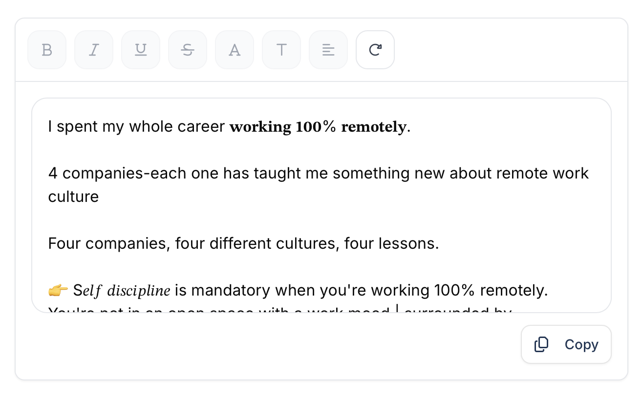
Make text bold, italic & underlined on LinkedIn
Here’s how I do it every time I post, in 6 easy steps:
- Open the LinkedIn formatter
- Paste or write your content
- Highlight the section you want to format
- Choose Bold, Italic, or Underline
- Preview it to make sure it’s clean
- Copy and paste into your LinkedIn post
That’s it. And rest assured that this works on mobile too. I format my weekly update from my phone every Friday.
Add bullet points, symbols & decorative text to your posts
This made a big difference for me.
LinkedIn does not give you native bullet points or headers, but you can fake it like this:
• Bullet for key points
▶ To guide attention
✱ Section headers like “✱ Weekly Recap”
When I added headers like:
✪ Lessons from this Week
❖ Client Wins
My posts felt more structured and creative. One symbol per section is enough, no need to overdo it.
Why you should format your LinkedIn posts
I used to write long blocks of text. To me, they made sense. But on LinkedIn, they did not work. People would scroll without reading. No reactions, no comments, no messages.
And the reason is pretty simple: reading something on the Internet is not the most comfortable activity for your eyes. You won’t read a huge block of text. I bet that you’ll leave the content within the first 2 sentences.
Everything changed when I started organizing my posts differently. I began using short paragraphs, clear spacing, and simple visuals to guide the reader. Suddenly, the same texts were getting noticed. My posts started conversations. People replied, shared, and saved my content.
Clean formatting makes it easier to follow your message, especially on mobile (70% of people use LinkedIn on a mobile phone). If your content feels simple to read, it holds attention longer. It also shows care. Readers pick up on that. They see structure, and they trust what they’re reading a little more.
That’s also part of your personal brand. How you write, how your posts look, these small things make people remember you. The structure becomes part of your voice. You can try to write your first formatted post here, or sign up to Taplio – it’s free!
Don't Over-Format Your LinkedIn Post
The extreme opposite is not the solution either! Symbols and fancy fonts make sense when you use them with parsimony. It’s in the balance!
Screen readers can't read formatted text properly
If you’re writing for a broad audience, accessibility matters. Special characters and decorative fonts might look nice, but they confuse screen readers. People using assistive technology may not understand your message at all.
So here’s my rule: keep your core message in regular text. Bold what matters, skip anything unreadable, and never use special characters inside URLs or hashtags.
Your formatted posts might break on some devices
Unicode characters don’t always render the same way across platforms. That fancy serif font might look sharp on desktop but break entirely on certain mobile phones or browsers.
I always test my post before publishing. I paste it into LinkedIn, then preview it on both desktop and mobile. If it looks weird on one, I switch the style.
I also use Taplio’s LinkedIn Text Formatter because it gives a clean preview across devices. No guessing.
When formatting hurts your professional brand
This was my toughest lesson. I once announced a new hire using a decorative font. I thought it made the post stand out, until a senior exec replied: “This doesn’t feel like our brand.”
Now I stick to formatting that feels professional. Clean, consistent, and aligned with what I’d present in a meeting or a deck. When in doubt, less is more.
Use formatting strategically to boost your engagement
Bold formatting increases readability when used right
I did not always bold my posts. But once I started, I saw a shift. People noticed the important parts faster, and the comments came in. I think that on the Internet, people skim the text a lot instead of reading each word. Perfect reason to start bolding key elements!
I now use bold in three places:
- The opening line, to hook attention
- Right before a call to action or list
- Around a key takeaway I want readers to remember
I once ran a small test. Same post, two versions. One with bold for key ideas, one plain. The bold version? 60% more comments.
You know where I’m heading to: if you bold too much, it becomes noise. And screen readers might skip styled text, which isn’t great for accessibility. I bold the content with only the essentials.
Use italics to cite sources and highlight quotes professionally
Italics are my go-to for quotes or reflections. They’re lighter, more subtle, especially on mobile.
Sometimes I’ll write something like:
“This campaign taught me one thing: keep the message simple.”
It’s softer than ALL CAPITALS and easier to read. Just keep it short, italics don’t work well for full paragraphs. And if I’m quoting someone directly, I’ll sometimes use quotation marks too. Depends on how I want my content to look like.
Develop a formatting style that fits your voice
Your formatting style is like your writing voice, people remember it.
I’ve found my rhythm: bold first lines, a ✱ symbol for personal posts, and a short list or two. I repeat it in most posts, and people start to associate that style with me.
But that did not happen overnight. I tried different combinations until one felt natural. And when I write for a client in finance, I dial it back. When it’s for creatives? I loosen up a little.
Formatting is not a one-size-fits-all. What matters is that it feels like you, fits your audience, and stays consistent over time.
Try formatting your content with Taplio – it’s free to sign up!
4 advanced formatting techniques that keep people reading
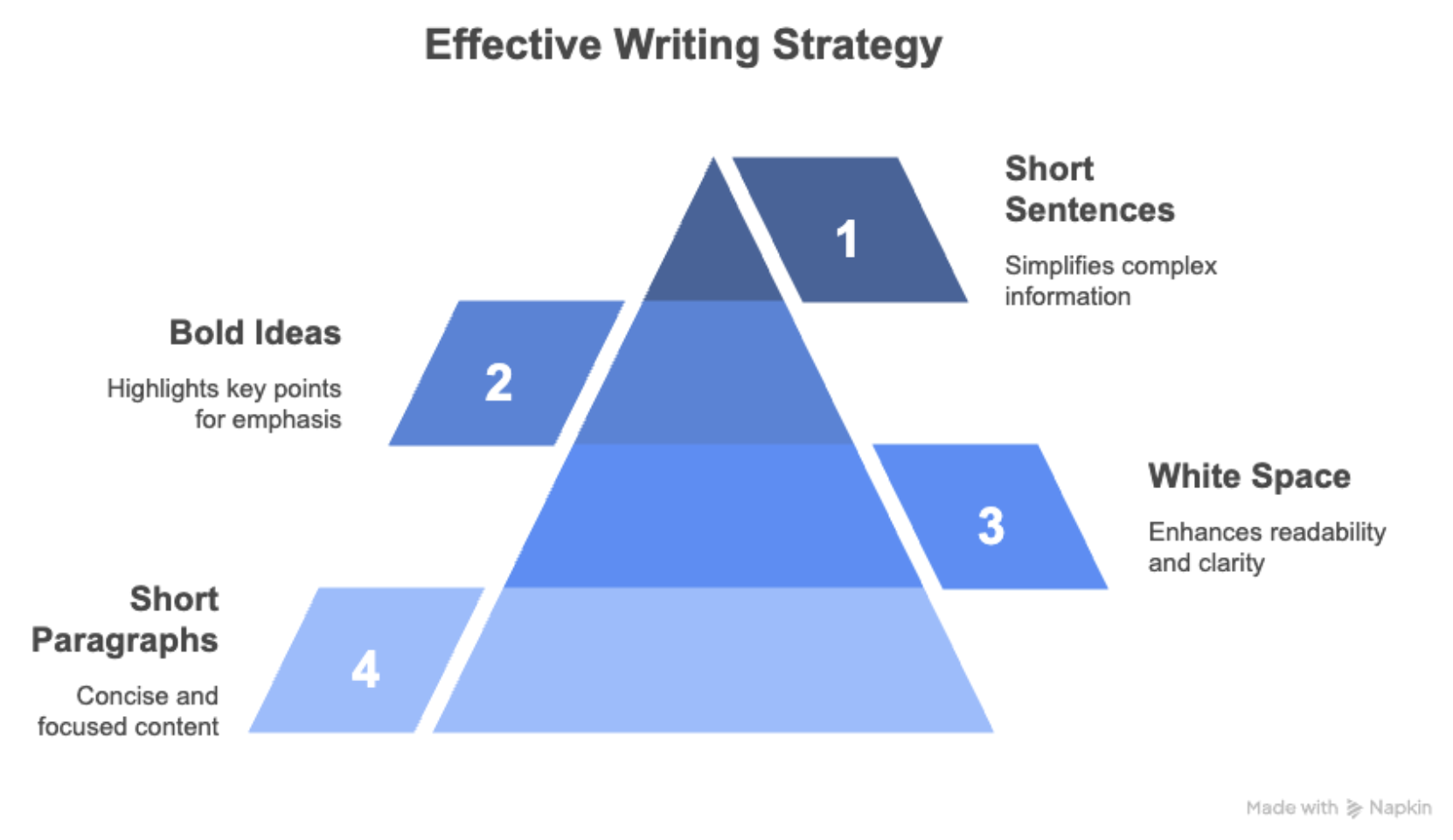
Structure long posts so more people read to the end
Big blocks of text used to be my thing, until I realized people weren’t reading them to the end. Now, I follow a few formatting rules that work especially well on mobile:
- I break posts into short paragraphs.
- I add white space between sections.
- I bold key ideas to guide the eye.
- I use short sentences.
Every post starts with a strong hook and ends with a clear CTA. It’s not magic – it just makes the post easier to scan, especially when people scroll fast on their phones. It’s also the structure to tell stories.
Before, people would skip. Now they read, and comment!
Balance emojis and formatting without looking unprofessional
I like emojis. But I’ve learned to use them like seasoning, not for the whole dish.
A checkmark ✅ next to a list item works. A single 🔁 to signal a repost? Fine. But five 🔥 in a row? That’s too much.
What I’ve noticed on LinkedIn is that the most credible posts use emojis purposefully, not decoratively. I stick to 1–2 max. If the post starts looking like a group chat, I dial it back.
It’s also worth noting: most professionals on LinkedIn follow this unspoken rule. If your audience is in finance, law, or B2B: subtle wins. Last advice: words should be enough to explain a concept, emojis are a support only.
Make your formatted content accessible
Before I hit publish, I strip the formatting and read the post aloud. If it flows, it’s good to go.
I do this because I know screen readers can struggle with heavy formatting. Also, some fancy fonts don’t show up properly on mobile phones.
So now: I stick to clean styles. Bold for emphasis. Italics for quotes.
When you write a text, accessibility should be your priority over formatting enhancement. “Does it make sense for the audience?” That’s the question to ask yourself.
Test and measure your formatting
Formatting is part of your content strategy. Every month, I look at my top 5 posts and ask:
Where did I use formatting? Did it support the message? Did people engage more?
I look at likes, comments, and click-through. But the big one? Replies. When a formatted post sparks conversations, I know it worked.
I use Taplio’s post scheduler to preview how a post looks on mobile and desktop. It helps me test different layouts and see what performs best.
If you want to start getting engagement with your content, read this article to publish great ideas in a structured way and boost your engagement!
Frequently Asked Questions
Does LinkedIn have a built-in formatter?

No. LinkedIn's post composer has no bold, italic or underline button. The only way to publish styled text is to substitute the letters with Unicode characters that look styled, which is what this formatter does before you paste the result into LinkedIn
Can LinkedIn posts be formatted?
Yes, but not through LinkedIn itself. You format the text elsewhere, then paste it in. Type your text in the tool above, select the words you want to style, pick a style, and copy the result into your LinkedIn post, headline, About section or comments
How do I bold text in a LinkedIn post?
Paste your post into the editor, highlight the words you want in bold, click the Bold button, then click Copy. The bold characters travel with the text when you paste them into LinkedIn. Bold is the most used style on LinkedIn, usually on the first line and on key figures
Is formatted LinkedIn text searchable?
No. Bold and italic characters are separate Unicode code points, so LinkedIn search does not match them against the normal letters people type. Never format your name, your job title, your company name or any keyword you want to be found on
Will formatted text look the same for everyone?
Not always. Styled characters depend on the fonts installed on the reader's device. Older Android devices and some corporate desktops show empty boxes instead of the styled letters. Script, Gothic and Doublestruck are the most likely to fail, Bold and Italic the most reliable
Can screen readers read formatted LinkedIn text?
Poorly. Most screen readers either skip Unicode styled characters or read them letter by letter with the name of each symbol, which makes the sentence unusable. Keep formatting to a few words and never format a whole post or a call to action
Can I change the font in a LinkedIn post?
You cannot change the font itself, LinkedIn renders every post in its own typeface. What you can change is the characters. The styles in this tool are Unicode variants that look like different fonts, which is why they survive the copy and paste
How many characters can a LinkedIn post hold?
3,000 characters, and only the first 3 lines on desktop or 2 on mobile appear before the see more link. The preview in this tool shows exactly where that fold falls, so you can check your hook before you publish
Is this LinkedIn formatter free?
Yes. No account, no signup and no limit on the number of posts you format. The text is transformed in your browser and never leaves your device
Explore our LinkedIn tools
Linkedin Text Formatter
Learn More
Heading Generator
Learn More
Linkedin Carousel Generator
Learn More
LinkedIn Video Downloader
Learn More
LinkedIn Post Examples
Learn More



.png)