


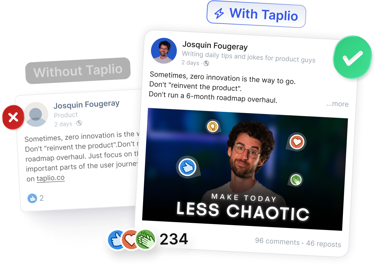
2,847 creators joined this month
Grow your LinkedIn audience 3x faster
AI writing, carousel maker, scheduling, analytics, and lead finder. All in one tool.
Try Taplio for free7 day free trial - Money back guarantee

I still remember the first time I tried to bold text in a LinkedIn post. I had crafted what felt like the perfect hook, hit publish… and watched it disappear into a sea of grey paragraphs. No emphasis, no structure, nothing that made the message stand out. I went looking for the bold button, scrolling through every corner of the editor, only to realise LinkedIn doesn’t offer one.
If you’ve been there too, you’re not alone. Every week, thousands of people search for how to bold text in LinkedIn posts, convinced they must be missing a hidden feature. The truth is simpler: LinkedIn doesn’t support native formatting, but you can still bold text with the right tools.
In this guide, I’ll walk you through the methods I use today, the limitations nobody talks about, and the formatting tricks that actually improve engagement and not just appearance.
I’ve tried every “LinkedIn bold text” workaround over the years, but nothing feels as reliable as using a Unicode formatter. That’s why I always start with the Taplio LinkedIn Post Formatter, it converts regular text into bold, italic, or monospace characters that LinkedIn accepts without breaking the layout.
It works on desktop and mobile, and the text displays correctly in most device environments.
Here’s exactly how I use it:
The result looks native, but behind the scenes, it's Unicode.
When I’m writing posts on the go, I sometimes rely on apps instead of desktop tools. Mobile solutions work well if you often post from your phone and still want bold text in LinkedIn posts.
Here’s what has worked consistently:
Mobile Apps (iOS & Android)
Browser Extensions (Chrome & Firefox)
These tools sit one click away in your browser bar, which makes formatting faster when you write long posts.
Before I used dedicated tools, I experimented with manual methods. They’re less practical but still useful when you just need a quick bold word for a single LinkedIn post.
Here are the ones that worked for me:
Character Map Utilities
Windows and macOS both include built-in Unicode character maps. You can copy bold-style Unicode characters (like 𝐁, 𝐨, 𝐥, 𝐝) and assemble your text manually.
Online Unicode Libraries
Sites like Unicode Explorer or Compart display every bold Unicode character available. I used them when I needed a rare style not offered by generators.
Quick Copy-Paste Techniques
Sometimes I simply kept a Notion page with common bold snippets:
Copy the one you need and paste it straight into your LinkedIn composer.
Manual methods get the job done, but if you post often or care about consistency, the formatter method is faster and looks cleaner in the feed.
I remember the first time I realised LinkedIn had no bold button. I kept clicking around the editor, convinced I had missed a hidden menu. But LinkedIn’s decision is intentional, and the logic becomes clear once you look under the hood.
LinkedIn avoids native bold formatting for a few reasons:
Screen readers often cannot interpret Unicode bold characters. Instead of reading the words normally, they may skip them or read each symbol as gibberish. For visually impaired users, this means:
If you work in HR, consulting, education, or any field with compliance requirements, this becomes even more important. Accessibility is increasingly tied to legal frameworks in many countries, and inconsistent formatting can become a risk.
I now keep formatting minimal and rely on clarity instead.
I learned quickly that bold Unicode text looks good but can harm discoverability. Here’s why:
If LinkedIn SEO matters to you, keep essential keywords plain. For deeper optimisation, I use Taplio’s LinkedIn SEO guide
One thing I learned the hard way: bold text doesn’t look the same everywhere.
On some mobile devices, Unicode bold appears misaligned. Certain browsers replace characters with empty squares. And older operating systems may show encoding errors that make your post unreadable.
When formatting matters, always preview your post on both desktop and mobile.
Bold text works on LinkedIn when it guides the reader without taking over the entire post. I use it only when it adds clarity and makes the structure feel intentional rather than decorative.
Here are the situations where bold formatting makes sense:
There are also moments where bold text quietly damages visibility, clarity, or even credibility.
I avoid bold formatting when the sentence contains essential information or keywords I want LinkedIn to index. Unicode bold isn’t reliably searchable, so using it for important terms can reduce discoverability.
I also avoid bold text in any accessibility-critical content. Screen readers often skip or misread Unicode, which means part of your message may become inaccessible for visually impaired users. In industries where content must respect professional or legal compliance, stylised text can appear unprofessional or inconsistent with standards.
Finally, I avoid over-formatting. Too much bold text creates visual noise, breaks reading rhythm, and makes the post feel forced.
When I stopped relying only on bold text and started using LinkedIn’s built-in features, my posts became easier to read and performed better. The platform already gives you tools that create emphasis without causing accessibility or SEO issues.
Strategic line breaks help create rhythm and guide readers through long posts. I use spacing to separate ideas and make my content feel lighter on the feed. Bullet points and numbered lists are great when you want clarity without over-formatting, especially in instructional posts.
Emojis also help when used with intention. A single 🎯 or 📌 can highlight a key idea without looking childish. And when I want the message to stand out visually, I combine the text with native visuals like images, screenshots, or carousels. These formats tend to attract more attention than stylised text alone.
If you want to understand which formats your audience reacts to, Taplio’s analytics tool gives a breakdown of post performance.
I’ve learned that structure influences engagement more than formatting ever will.
The right hook makes readers stop scrolling, whether it’s a surprising fact, a relatable moment, or a short tension-building line. Clear visual hierarchy, short paragraphs, clean spacing, and intentional grouping, keeps people reading longer.
These techniques consistently outperform any styling trick. When I’m planning a post, I revisit Taplio’s guide on LinkedIn content to refine the structure.
Formatting text on LinkedIn looks simple from the outside, yet it becomes confusing the moment you try to make a sentence stand out. I’ve gone through every workaround, every Unicode trick, and every mobile shortcut. What I learned is that bold text can help, but clarity, structure, and intention matter far more than any formatting hack. Using emphasis with intention makes your posts cleaner and easier to read on any device
If you want to experiment safely, start small, test on different screens, and keep your keywords plain so LinkedIn can index them. The right balance between formatting and structure will always outperform visual shortcuts.
Want to make experimentation easier? Try Taplio and see what works best for your posts.
No. LinkedIn only supports plain text in posts. You need a Unicode text formatter to create bold characters.
Yes. Formatters work on iPhone and Android, though some characters may display differently on older devices.
Usually not. LinkedIn often ignores Unicode bold in search results, so important keywords should stay plain.
No. Unicode is safe to use. The only risk is readability, not account safety.
It means the device can’t render the Unicode style. Switch back to plain text or try a simpler bold variation.
Yes. Taplio offers a free text formatter. Mobile apps and extensions also exist.
It helps highlight key ideas, but engagement depends more on structure, clarity, and the hook.
Yes. Unicode bold works in posts, comments, and DMs the same way.
Use a mobile app or open a formatter in your browser, convert your text, copy it, and paste it into the LinkedIn app.
Screen readers may skip bold Unicode, LinkedIn may not index formatted keywords, and some devices may show broken characters.
AI writing, carousel maker, scheduling, analytics, and lead finder. All in one tool.
Try Taplio for free
Get free monthly benchmarks on reach, engagement, and content format performance.
Get the Benchmark


.png)
